Four Quarters
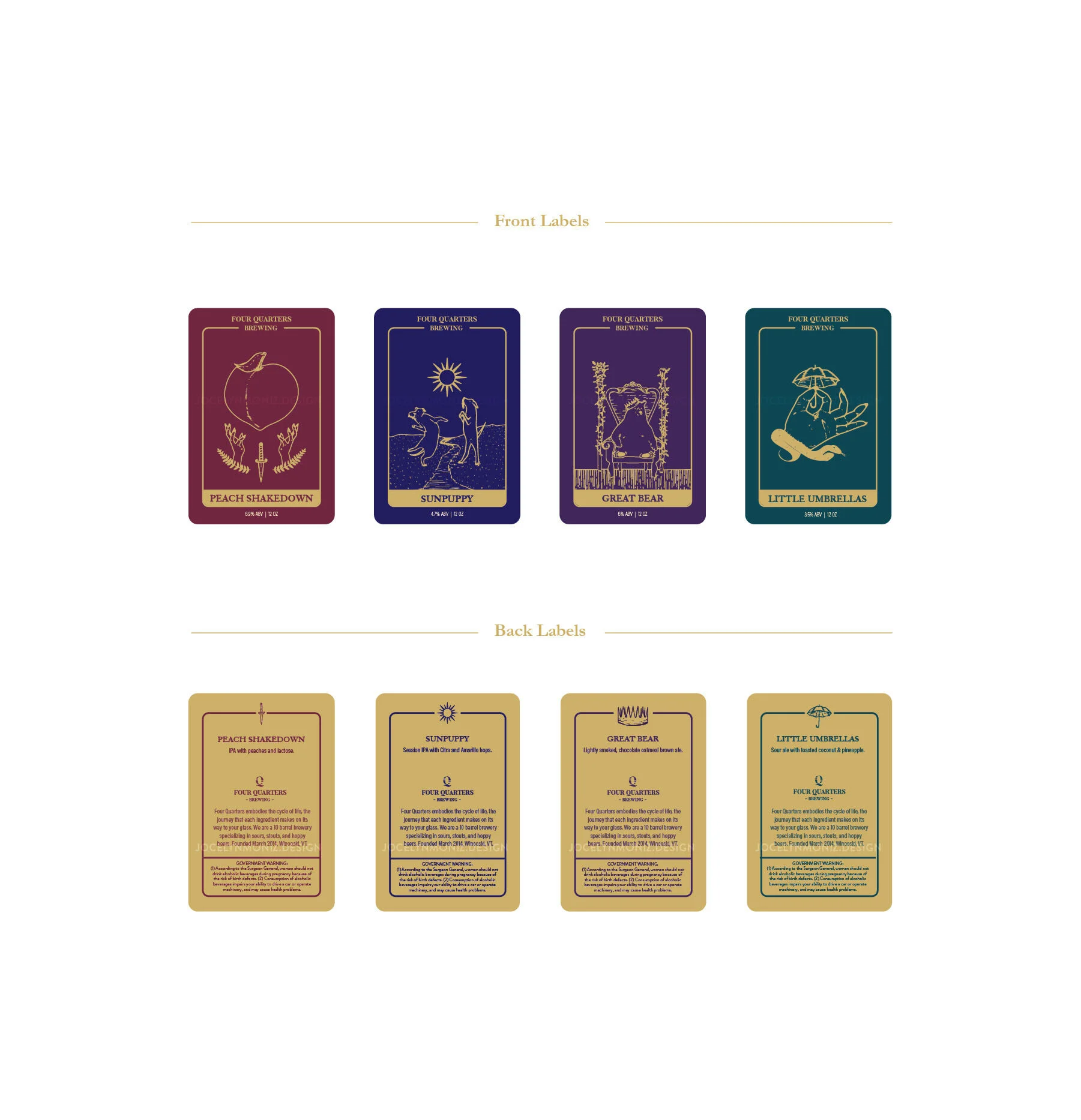
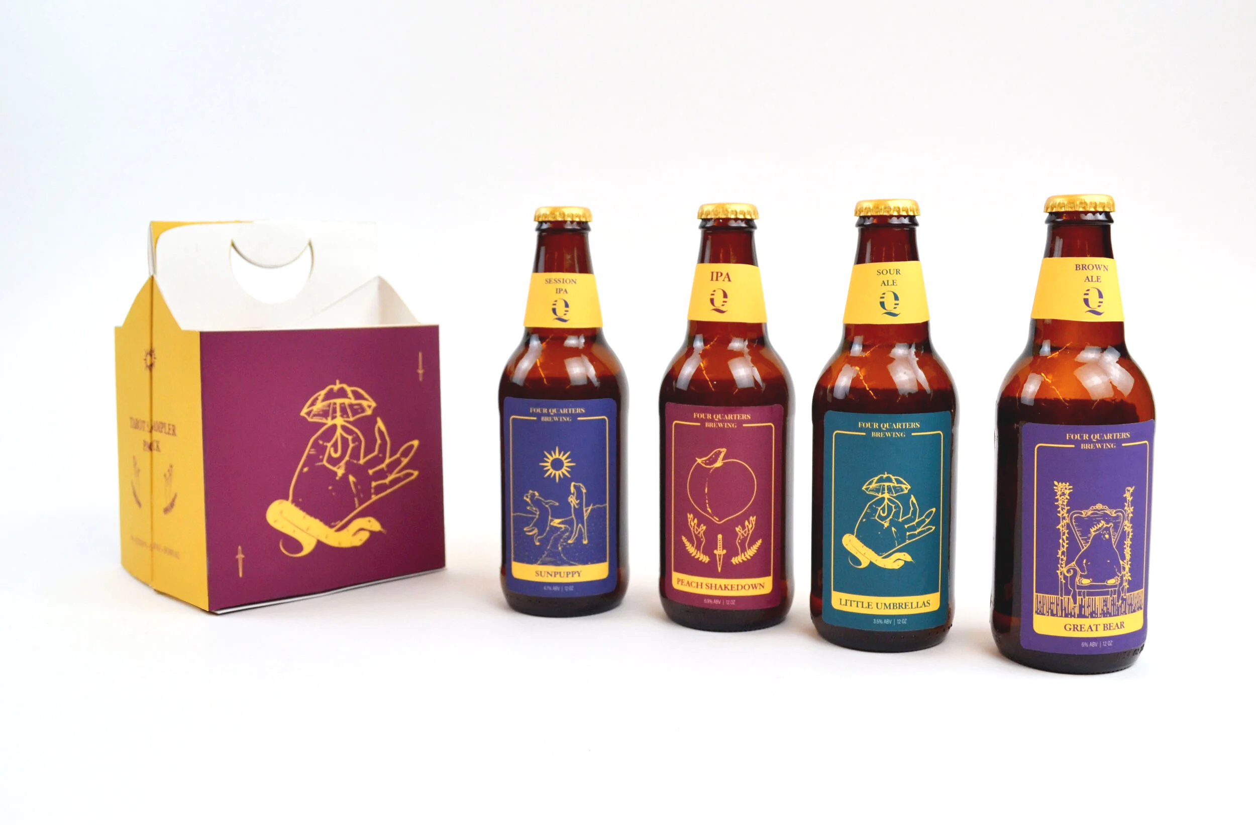
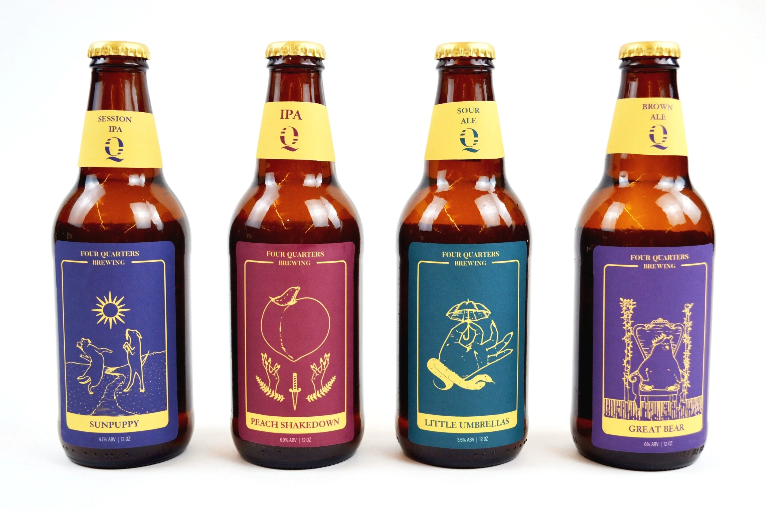
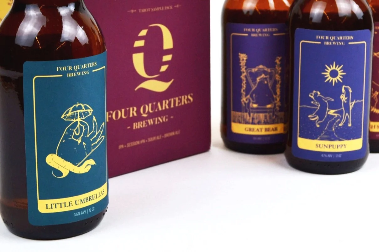
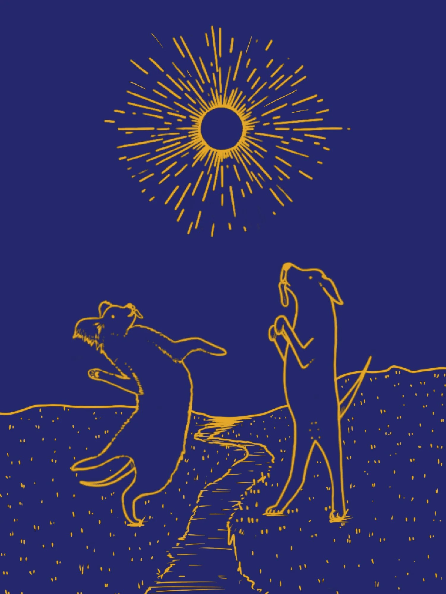
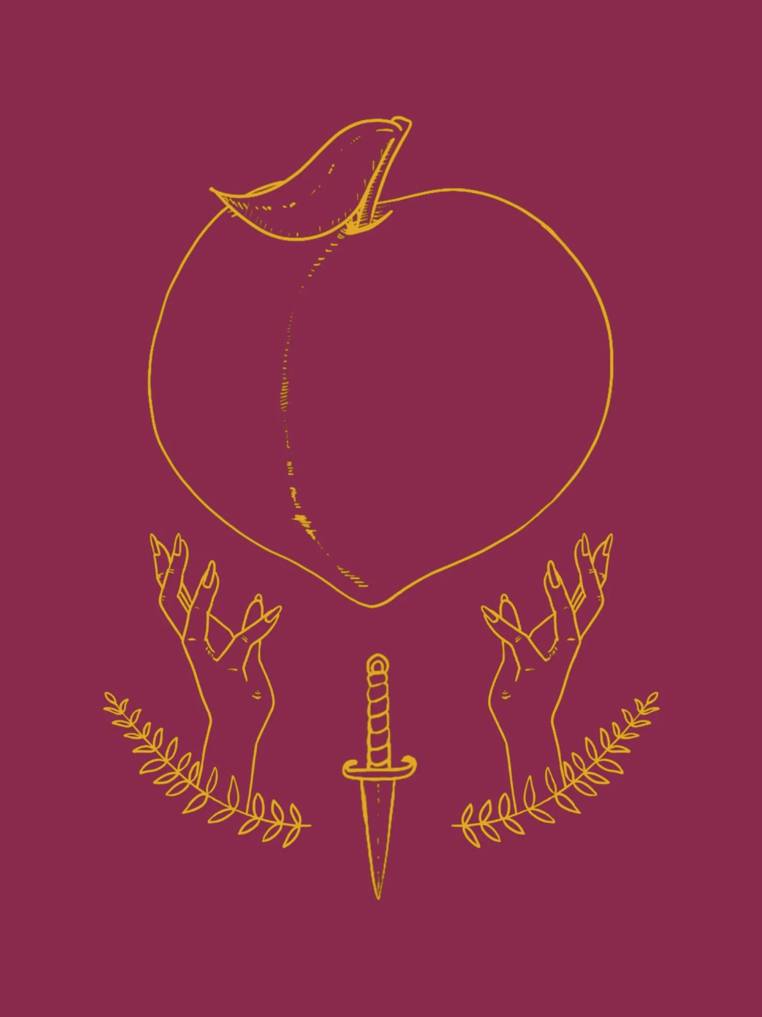
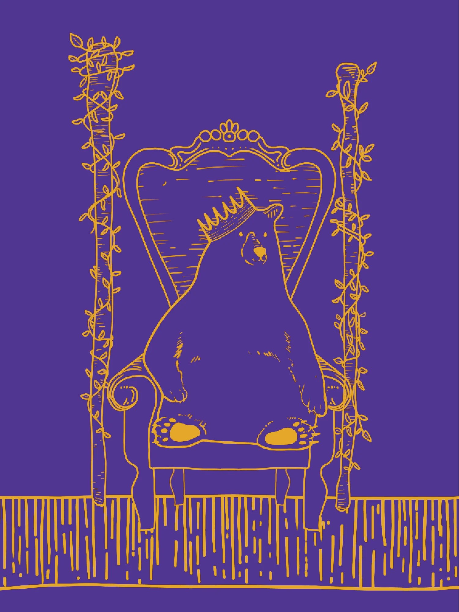
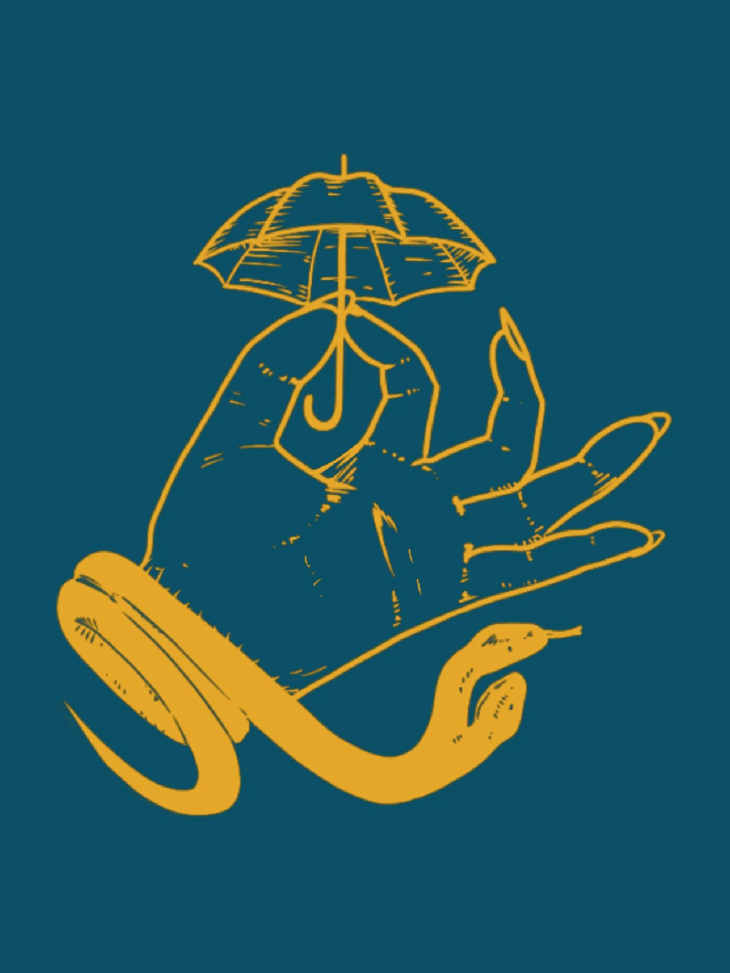
Four Quarters is a rebranding project based on an existing brand. For my concept direction, I drew from tarot card imagery and astrology, playing off the brand's name and its ties to the moon's phases, with each quarter tied to a different lunar stage and its own visual language. The labels have all been illustrated with fun, lighthearted motifs, pulling in celestial symbols like stars, moons, and suns alongside small nods to each card's meaning. The result is a set of designs that feel cohesive as a system but still give each phase its own personality.